Most redesigns FAIL. And Here is why-
This write-up presents you the case study on notable redesign fails and what we can learn from them.
Why do brands or products need redesign/rebranding?
Creating a consistent brand for your product may sound easy, but is not a piece of pie. With time the brand and style becomes the voice and character of your product and when it comes to redesigning, it becomes very hard to break that character. If the product has sat with the same tone of character for ages, it becomes even more difficult as users accept the same old ingrained flow and working of the product and expect to remain the same.
A product needs redesign or a rebranding if they experience or try to do the below :
Low profitability and old strategies - Many times companies suffer from low conversion rates, higher customer churn and lower profits margin. At this point owners think hard how to abandon the normal marketing conventions and go for the new powerfully irresistible solutions.
Scale up and Expand brand’s footprint - Here companies intend to spread their brand’s presence on the markets. More the customers and larger market share they are gonna get, the more efficient marketing and UI/UX enhancements they adopt and add them to the product to outperform their competitors.
Why do redesigns fail?
Redesigns are the inevitable part of any user facing product, where it should stay current and fresh in this forever-changing market. These changes are important for websites, apps or any product that interacts with users or stakeholders daily. By conducting a proper usability test and data driven process, a redesigned product can increase conversion, sales and users happiness.
But people don’t like changes, when a product is doing a massive change, lets take for example changing the user profile screen to some other fold of interface where before it was available when you clicked on your profile pic, here you are asking them to break a habit.
Now you will make the user think more than twice to navigate to the same place, where they used to do the same without thinking. This creates small collective heaps of aggressions and irritations in your user’s mind.
Some of the notable redesign fails -
i) Instagram rollback in 2018
A very notable weird redesign action which rolled in 2018 with Instagram’s Horizontal scroll to view and move through the posts. This update was terrible and users instantly reflected upon this.
And the Instagram official announced this as a bug, announced they are rolling back the update and in no time the vertical scroll made its comeback.

ii) Snapchat’s Navigation Redesign
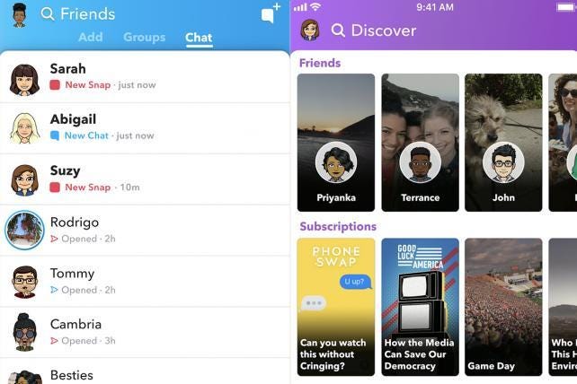
In Snapchat’s last redesign they twigged their core user stories - viewing stories published by friends.
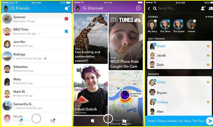
In the old version you had to swipe left to view stories and swipe right to chat with friends. To view stories from your friends you had to swipe left from the camera/snap screen and then click on your friend’s story. Along with this the promotional stories from celebs and media use to come along with friends stories too.
Next in the redesign they included the chat and stories from friends in the same screen and one dedicated screen was given to the paid or promoted stories.
And, with this the area to click onto the stories were much wider and had larger scope as the whole rectangle was available and after redesign they shrunk down to a much smaller circle and put it on the extreme left side to the screen.
Users did not like these two principle changes going on with the app, as per metrics within a week the average rating of snapchat app dropped from 3.1 stars to 2.4. Ad views and revenue went down by 36%, users called Instagram their new home. Ouch Nightmare!
But seeing this reaction 6 months after the redesign roll out, Snapchat decide and announced a reversal, and announced in quotes -
We learned that combining watching Stories and communicating with friends into the same place made it harder to optimize for both competing behaviors. We are currently rolling out an update to address this by moving Stories from friends to the right side of the application.- Evan Spiegel, CEO Snapchat
Learnings 💎
So are all redesigns bad? Is a continuous effort to create a more intuitive and get higher conversion rate all waste?
Well, it is very easy to think the same with the above examples of tech giants, that putting extra time on redesigning a product might not be a good investment of time and money.
But eventually your product will be phased out of this ever evolving market if you “Play It Safe” here by not evolving with the need for the time.
🔹
First, Keep it obvious, lightweight and progressive:
One very good example of a redesign is Facebook. Facebook has always cleverly understood how to redesign the navigation to find friend requests, messages and notification in the mobile app.
At first they kept the navigation of mobile app (Android and iOS) similar as their website with identical action bars.
But slowly mobile user admirers were increasing back in 2012 and also social networks like Hike(rip), Instagram and snapchat were gaining a lot of popularity. Most people were able to foresee that we will be spending more time on our phones rather than desktops.
So here Facebook decided to drop the regularity and simplify the navigation bar by treating Android and iOS as two different products.
Android app got the slidable tab sticky bar on top while iOS got the static tab sticky bar on bottom.
These changes were new for the app but not for the users, as they were already familiar with their platform specific nav bars. Both of the changes did not feel alien to the users and they were happily onboarded. They became an industry standard shortly with most apps (Android and iOS) having navigation similar to this.
🔹🔹
Second, Don’t redesign your product for the sake of better-looking visuals
Visuals are a part of the redesigns but it’s not the whole redesign. If you are redesigning your product as per the new UI/UX trend without any design research to back it up, your redesign will fail eventually.
Redesigns are meant to solve problems with particular business constraints and requirements.
🔹🔹🔹
Third, It is a continuous Process of Trial & Errors
Product design is a continuous process of researching, testing, analyzing and rectifying the product or process. Any redesigns done does not mean that the process is completed and the evolution of your product is finished.
🔹🔹🔹🔹
Fourth, Focus on the minute changes and conversions
When we focus on conversions it is generally on bigger and wider metrics like number of sign ups, apps installed and sales generated. The micro conversions are often neglected and not tracked. The minute changes and conversions leads the user to the end goal. The minute conversions like users rating your apps which you shoot them very often, using search bar features, changing their profile pic, these all small metrics add up to bigger conversions.
After analyzing the minute conversions and building these small milestones we reach to the bigger picture, and it always helps in re-iterating again and again for a better user journey.
I hope you enjoyed this post, I generally post every Wednesday and Saturday. Subscribe below to get more interesting write-ups. I won’t spam you, promise 👀


